The constraint that became the form
A small client, a fixed budget, and one rule that ended up defining the whole system.
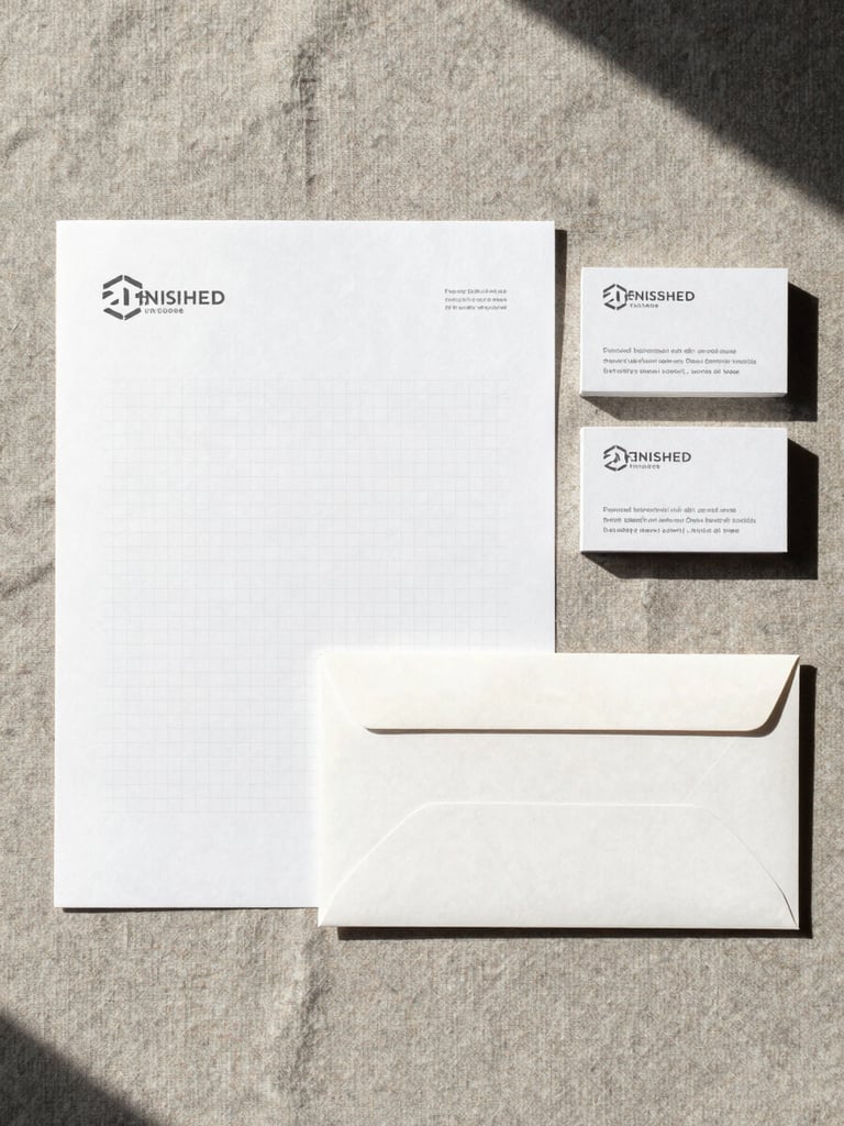
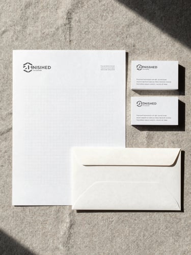
One typeface. No photography budget.
The client needed a complete brand system for launch in six weeks. No photography, no illustration budget — only type, geometry, and a single spot color.
The question wasn't how to work around that. It was whether the restriction could become the identity itself — something that read as deliberate, not economized.
Grid as the only material
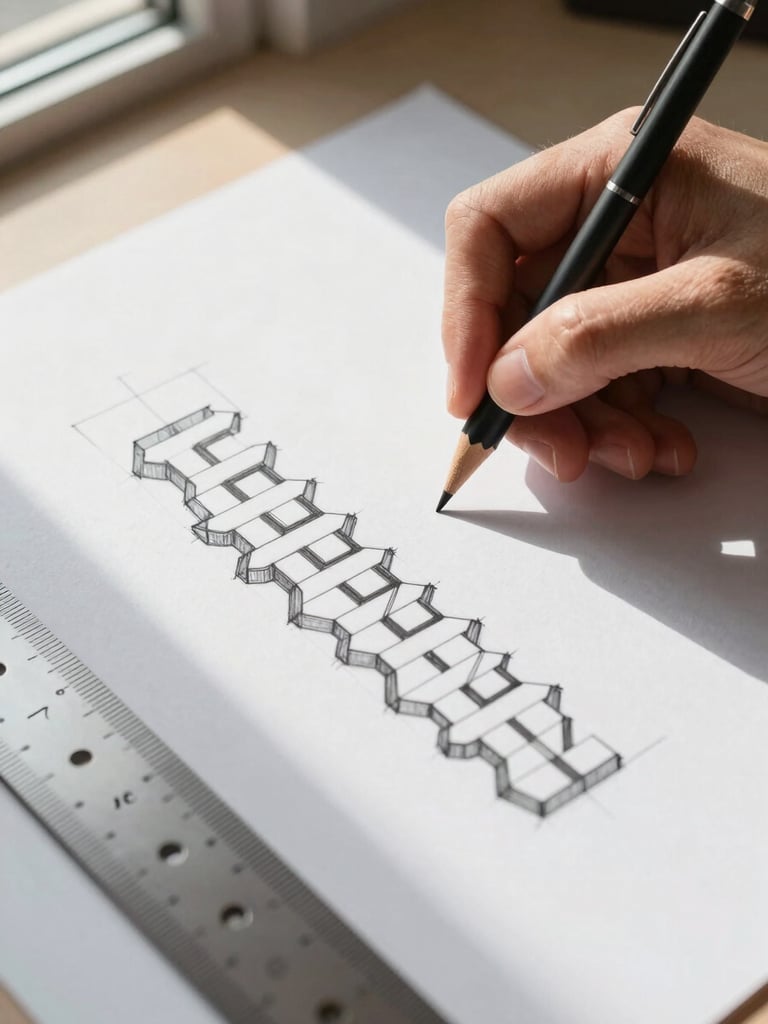
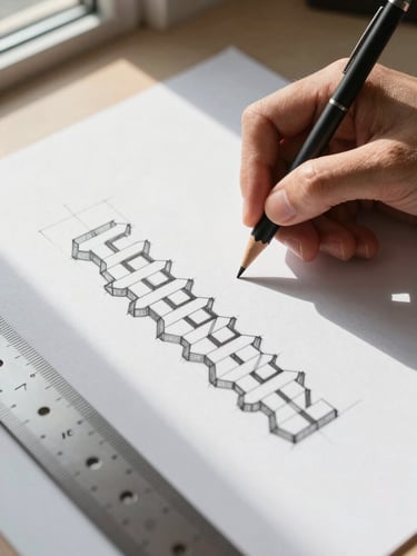
Every layout was built on a strict 8-column grid, with type set at three fixed sizes. The grid wasn't a scaffold — it was the aesthetic argument.
When the typeface is the only visual tool, scale and spacing carry the full expressive load. Each decision had to justify itself against that rule.
A system that holds at every scale
The delivered system covered stationery, signage, and digital templates — all derived from the same grid logic. No element required a special case.
The client launched on schedule. The restriction that looked like a problem became the reason the work has a point of view.