Close-up of a finished brand identity system laid out on a warm gray desk — business cards, envelope, and printed collateral arranged in a tight grid under soft natural window light, edges sharp, paper texture visible
/ Case Study 02

Constraint as the brief's sharpest tool

A small business needed a visual identity that worked across print and digital with no margin for ambiguity. The client's constraints became the origin of the final form.

Wide flat-lay of mismatched printed materials — different business cards, inconsistent flyers, and varied letterheads spread across a light gray surface under even diffused daylight, showing visible fragmentation and lack of system
— The Problem

Fragmented materials, no coherent voice

The client had accumulated three years of mismatched collateral — two typefaces, four logo variations, no defined palette. Every touchpoint read as a different business.

The brief asked for consolidation. What it needed was a documented decision framework so future materials would stay coherent without the designer in the room.

Designer's sketchbook open on a wooden work table showing typographic studies and annotated margin notes, a pencil resting beside it, natural side-window light casting soft shadows across the page
Decisions Made

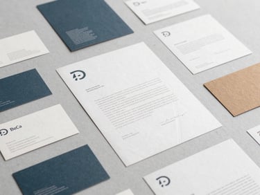
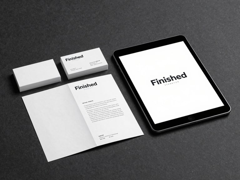
One typeface. One anchor color. No exceptions.

Audit first: every existing touchpoint catalogued, every inconsistency named. The client needed to see the problem as data before accepting the solution as necessary.

A single-weight geometric typeface and one warm neutral anchor resolved the visual noise. Each choice tied directly to a client constraint — budget, reproduction method, or audience expectation.

Finished brand system displayed in context — a cohesive set of business cards, a folded brochure, and a digital mockup on a tablet, arranged on a dark charcoal surface under focused studio light, every element aligned and resolved
Resolved Outcome

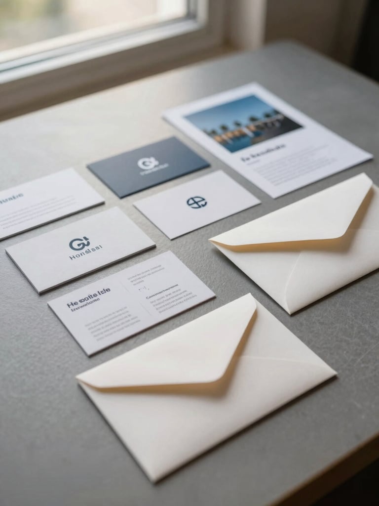
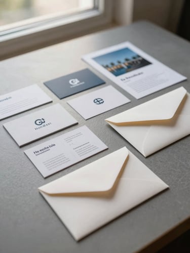
A system the client can run without us

Every deliverable shipped with a one-page decision record — not a style guide, a rationale document. The client knows which rule to apply and why it exists.