Form follows the brief, not the trend
A print identity designed around a single hard constraint. Every decision documented from brief to press.
One budget. One material. No shortcuts.
The client needed a full print suite on a single-paper stock with no spot colour. The constraint wasn't a problem to route around — it became the design's structural argument.
Proportion, weight, and white space had to do the work that colour usually handles. The brief was precise about what the artifact needed to communicate; the design had to be equally precise.

Named and justified
Typeface: Bricolage Grotesque at two weights — the contrast carries hierarchy without a second colour.
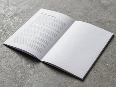
Paper: 130gsm uncoated. The texture reads as considered, not economised.
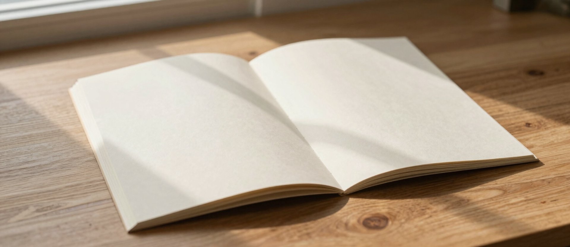
Proportion: a 3:4 format that folds flat and opens to a 3:2 spread — the format argues its own logic.
Artifact in working context. The fold, the margin, the weight — each chosen against the brief's single constraint.
Delivered against every line of the brief
Single stock, no spot colour, full print suite. The constraint that started the project became the reason the finished work holds together as a system rather than a collection of files.