Six projects. Six distinct problems.

/ Selected Work

Each project started with a real constraint. The work here documents what that constraint was, what decisions it forced, and what came out the other side.

Close-up of a printed brand identity system laid flat on a warm concrete surface, letterhead and business cards arranged in an editorial grid, natural window light from the left casting soft shadows
Open magazine spread on a light oak desk, two pages of dense editorial layout with wide margins visible, natural daylight from above, a pencil resting on the gutter
Packaging system for a small-batch product, three boxes stacked at slight angles on a warm gray surface, studio light from above revealing embossed surface texture
Digital UI screens displayed on a tablet propped on a white desk, interface showing a data-dense dashboard, cool daylight from a window to the left
Environmental signage installed in a narrow corridor, directional signs mounted at eye level on a pale wall, natural light from a skylight above casting clean geometry
Motion graphics storyboard pinned to a cork wall, hand-drawn frames in black marker beside printed type specimens, warm studio lamp lighting from the right
01

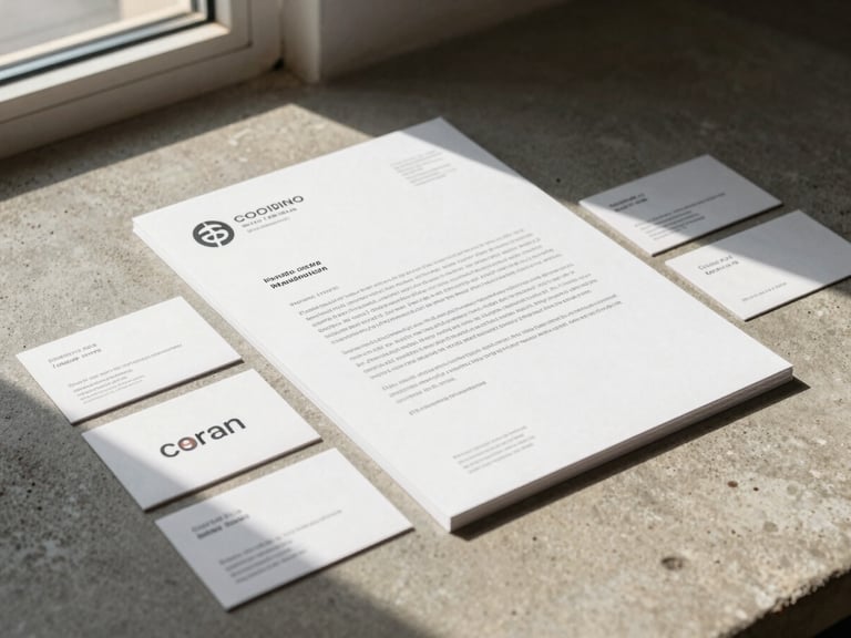
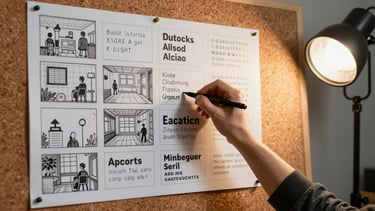
Brand Identity System

A complete identity built around a single constraint: no logomark, only type. Every decision traces back to that one rule.

02

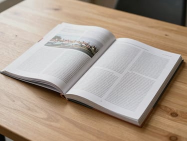
Editorial Publication Design

A quarterly print run with a tight budget and a wide subject range. Grid structure did the heavy lifting where photography could not.

03
04
05

Packaging System

Dashboard Interface

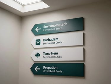
Environmental Wayfinding

Three SKUs, one coherent shelf presence. The constraint was a single print run for all three.

A reporting tool for a non-technical audience. Every chart was interrogated until the question it answered was obvious.

A wayfinding system for a multi-floor public building. Legibility at distance was the only brief that mattered.

Six projects across identity, print, packaging, digital, environmental, and motion. Each documented from brief to resolution.

06

The range is the argument. Each case study shows the decision path, not just the deliverable.

Motion & Type Campaign

A six-week campaign built entirely from type in motion. No photography. The constraint became the creative direction.

The work is the argument.

If the projects above raised a question about approach or availability, the about page has the context.